Learn Spatial Design with ShapesXR
Exploring an example game concept: Magic-o-rama Swords & Shields
My name is John, I am a designer currently working as a Spatial Computing Interaction and Product Designer at Nanome, a molecular design software company. I have worked exclusively in immersive UI/UX and interaction design for spatial computing platforms since 2020. I have experience designing applications for Meta Quest, PCVR, Microsoft Hololens and Magic Leap, and now Apple Vision Pro.
To make an interactive immersive game or application for Spatial Computing or VR/XR devices, it is best to engage early and directly with how it will feel and how users will play it in their real world spaces.
In this post I’ll go over how I get started on a project in ShapesXR using a hypothetical example let’s focus on a hypothetical game to explore how to optimize the design of your desired mechanics, we’ll call it “Magic-o-rama Swords & Shields” and it will do pretty much that.
Let’s say we want to have the ability to shoot spells, have a sword and a shield. There will be ranged combat from us and the enemies, along with close quarters combat. The goal is for it to feel fun, and slightly tiring, but not require the user to move around their space very much.
There are different aspects to design and experimental prototypes required to get to an outcome that feels fun and is a valid interaction in immersive spatial computing. One core aspect is the User Interface of the application. Others to consider are Enemy design, environment design and locomotion in the level. We’ll cover these more in later posts, for now we’ll start with the User Interface and block out some ergonomic aspects to consider.
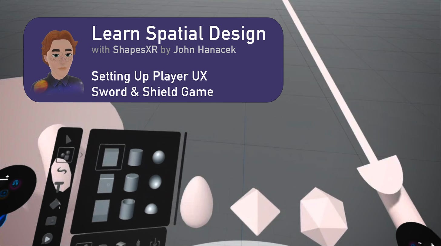
Below I’ll start off part of the User Interface showing some basic steps to get you going. This video shows the process and sections are excerpted below.
Let’s start by exploring how we want our game to feel and what kinds of motion the player will be making. This is where ‘accessibility’ blurs with ‘normal’ user experience design; in Spatial Computing everything must be literally accessible kinesthetically to the user’s body.
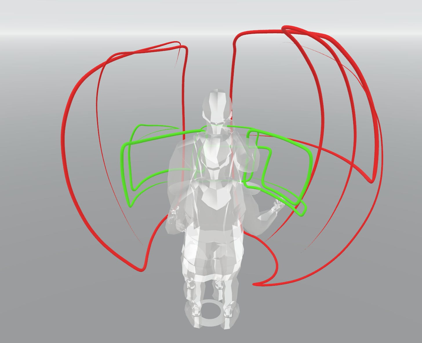
A simple trick to establish how users’ bodies will interact with your experience is to check by drawing out curves with the drawing tool, at maximum arm extension and comfortable arm extension. Choose different colors so you get a baseline of what is easy (green) and what is hard (red). If you can get some friends to jump in a collaboration session or just give them your headset and have them draw curves in different colors. Then use these to check if your UI is within range. This will help ground your design overall since you will always be thinking about the physical possibility of doing the gestures/actions you are asking of your user.
Curves seen from back - Red shows the hard to reach area, green shows the close and easy to reach area.
We can build a quick mockup. ShapesXR comes with some nice pre-made objects that can help us get started thinking through ideas without getting distracted with needing to create assets.
Make sure to keep your zoom level at 100% while you work for best results in your pipeline later.
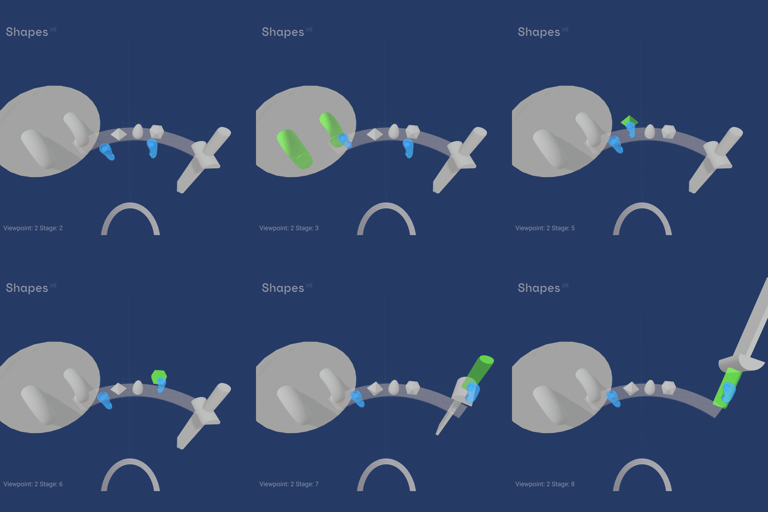
Thinking about the interaction mechanics happens naturally as you try to interact with the objects you are creating. We can further use stages to illustrate details about how the interface will work.
So now we have this first example of a visible inventory system, which could be used for hand tracking or with controllers. Signals a hover state with motion and a color or material change on proximity of the user’s controller, or hands.
Explore it for yourself in ShapesXR by entering this room code: xe53 13e7
The positives of this design are that it is immediately available to the user what they can do, it does not require them to know the right gesture or button. Some negatives are that it discourages seating, brings user focus down, and could lead to false positives since being within arms reach is good for easy access but potentially activated by mistake. This design pattern is used notably in the game Gun Raiders for Quest.
Further thinking will be needed as well for how each of the things should ‘pick up’ if they will respect exact grabbing, or if they will ‘snap’ into an ideal position, will the user need to hold them with an input method, or will it be a lock and unlock approach. You can keep going in different stages trying to explain all the different questions you find yourself asking as you try to build out a plausible experience.
Once you try out one way of making your interface and telling your UX story using stages in ShapesXR, try a few more concepts. I suggest trying at least three distinct ways to achieve your design goals and then see what works out best. Try to experiment with very different ways and get feedback early.
At the initial concept and prototype stage of a Spatial/Immersive design project, it’s not about being ‘right’ immediately, instead about getting the feel for what unique combinations will suit your goals.
You will want to experiment with the platform features and input types you want to use, along with which user interaction elements will be visible and directly interacted with vs activated with gesture or button press. Going full hand tracking means the need for either gestures or selectable UI elements or both. Controllers can use buttons or selectable UI elements. Quest platform offers a newer way to use just one controller which is under-explored. You are testing early if your experience can work on each platform you are targeting. Just remember that going with a platform specific interaction paradigm will limit your experience to running only on that platform.
Then, once your core conceptual ideas are worked out and validated, you can transition to leveling up the physical appearance with custom models. Yet it is really important to get your mechanics working well before you spend too much effort polishing! Ultimately, implementing interactivity through Unity or another engine of choice is the true experimental proof point for your concepts.
However, by starting in ShapesXR and iterating quickly you are approaching the problem unhindered by specific implementations. Keeping your interaction and interface design blue sky early in a project is important to ensure you are creating the best experience possible rather than just defaulting to existing toolkit settings and standards because that’s ‘how it’s done’.
Your design goals are the most important thing, they are what you are building toward. In ShapesXR you are bouncing your ideas off themselves really directly and can bring in collaborators to test and reason with you about how best to advance.
Immersive XR and Spatial Computing is still a very new medium and exploring ideas and play with concepts in an imaginary yet grounded way can result in really delightful implementations emerging that would have been missed otherwise.
Even if you land back on some standards that others have used before, you know that you tried a wide range and so that standard has earned its place in forwarding your design goals.
Remember to think spatially and immersive early because there are many details to work out, which can get hidden when you are just thinking or doodling. Direct experience with the medium of Spatial Computing brings you right to the edge of creativity in that medium. Excited to see what you come up with!


