Learn Spatial Design with ShapesXR - Prototype for Apple Vision Pro
Using Figma and Meta Quest Devices to prototype for Apple Vision Pro native app development
With the launch of Apple Vision Pro, we now have a new platform to create spatial and immersive content and experiences. Yet it is priced at the high end of the consumer market and is still maturing as a platform.
However, you don’t need to wait! The Meta Quest 3, Pro and even Quest 2 can enable you to get a jumpstart on designing for the VisionOS platform through ShapesXR combined with its Figma integration. Then you can develop using the Xcode simulator, while getting a sense for the final 3D output before you get access to a Vision Pro unit.
Apple provides a figma template which you can use to create designs. You can import these design frames into ShapesXR and keep them live linked during your iterations. Inside ShapesXR you can design your VisionOS application and get a feel for what you want it to be like, before you touch a single line of code.
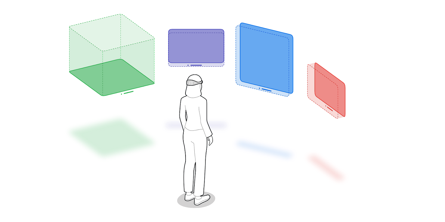
Before we jump in, quick refresher on the difference between Meta Quest OS and VisionOS. On Quest each application runs as an entirely immersive single application, with only limited system window overlays. VisionOS is set up with a multi application paradigm of windows and volumes where many different applications can exist and render side by side. This is part of why Apple calls it a ‘Spatial Computer’.
Apple describes their design paradigm as follows (quoted from https://developer.apple.com/visionos/ )
Windows
You can create one or more windows in your visionOS app. They’re built with SwiftUI and contain traditional views and controls, and you can add depth to your experience by adding 3D content.
Volumes
Add depth to your app with a 3D volume. Volumes are SwiftUI scenes that can showcase 3D content using RealityKit or Unity, creating experiences that are viewable from any angle in the Shared Space or an app’s Full Space.
Spaces
By default, apps launch into the Shared Space, where they exist side by side — much like multiple apps on a Mac desktop. For a more immersive experience, an app can open a dedicated Full Space where only that app’s content will appear. Inside a Full Space, an app can use windows and volumes, create unbounded 3D content, open a portal to a different world, or even fully immerse people in an environment.
Meta Quest apps are effectively like the Apple ‘Spaces’. So when you open ShapesXR it will be the only running app. Then inside ShapesXR, we can emulate Apple’s VisionOS paradigm.
Let’s now explore how you can simulate spatially windows, volumes and spaces for a fairytale app.
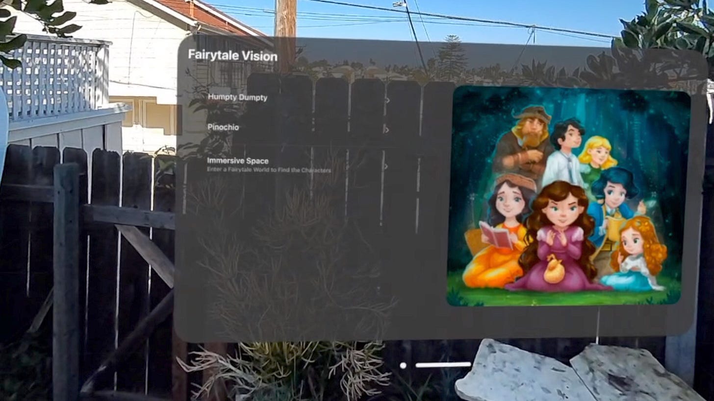
Our application’s main interface will be a Window with a home screen to select stories, and some of the stories in the window will have volumes of 3D models accompanying them. And finally we will have a 360 panorama with an immersive ‘spot the character’ game.
In Figma we can use the template to create a basic application menu set to define different screens and states, just like in traditional 2D UI/UX design. Apple has provided a handy Figma example setup that we can use.
Here I copied elements from the Apple Figma template and used auto-layout to set up a few basic artboards. I used Ideogram to create some custom fairytale images. For a more detailed Figma tutorial I suggest turning to Figma’s own youtube channel.
Note, you’ll want to turn up the Opacity of these background frames for best results on Quest, adjust the color fill under the window object.
In shapes we can bring the Figma artboards in and then arrange our 3D objects and set up the states. You copy the link to the figma artboard and paste it in the ShapesXR web portal. Once it is linked you can update the Figma artboard at any time and it will update in your Shapes prototype. Do this for all your artboards.
Each artboard will go into a stage. I often think of stages as the ‘keyframes’ or ‘states’ and lay out each of them first.
Video showing the setup process:
We will be using the Figma artboards to simulate an Apple VisionOS application window. The first ShapesXR stage represents what the app window will look like on first launch from the VisionOS home screen of icons. The design will just have a Window that links to the other stories.
Second ShapesXR stage shows Story 1 which is a Window and a 3D Model of Humpty Dumpty that represents a Volume that is opened when the Window transitions to showing the first story. In VisionOS application windows and volumes can both be moved independently, which would allow a user to adjust the location of the 3D volume (in this case, put Humpty on the wall).
Third stage shows Story 2 and is the same concept of a Window and Volume, except now it’s a 3D model of Pinoccio to match the story.
Then the last stage is the Space which has a Window that is the immersive control, along with the two 3D models from before and a 360 image skybox. In this stage, simulating the Space, the 3D models are no longer Volumes, but part of the Space. The small window here keeps track of the characters a user has found, and lets them go back to the VisionOS home layer where they will see the main application window again.
Apple’s VisionOS paradigm here is that In the Space, any other VisionOS apps that a user is running will not be visible, only the one. Whereas on the other Window and Volume states above, the user could have other apps open next to Fairytale Vision Pro.
To create the background of the Space stage we can use an inverted sphere with an image as the texture to create a skybox. You can create an image, use an existing one or we can have some fun and ask for a background from Blockade labs.
The secret here is in the ShapesXR inverted sphere template. Use a custom image instead of the sphereTemplate named “sphere.jpg”. Use a rectangular image of at least 1080p resolution. Upload the .obj , .mtl and .jpg all at once to the ShapesXR web portal. It will then be available in assets. You can upload multiple of these to ShapesXR to create different environments
Now the best part of this whole setup is that we can tweak any of the Figma artboards and re-sync them in ShapesXR while keeping everything else in place. This saves tons of time when doing revisions. So now you can update the contents of your application window as you improve the design, and can add more Figma frames as you progress.
If you want to test your design using the interactive play mode, you can add objects over the top of your Figma files in ShapesXR that serve as the targets for the play mode. Quest 3 does not have eye tracking, but you can still test your XU logic in an immersive way. On Quest Pro you could even try out basic eye interaction, although it is not identical compared to VisionOS’s implementation.
Wrapping up, with this setup you can simulate having an application window with related 3D volumes, and immersive spaces with backgrounds. Using the Meta Quest headsets with ShapesXR lets you design and iterate on a native VisionOS application without having direct access to an Apple Vision Pro. The VisionOS simulator is fine while coding, but it is still important to have a feeling for what it will be like to experience your app.
Visit the Examples from this blog
ShapesXR Prototype code a661 856e and link to space.
Resources Used


